
tic tac sound logo
As Brand Strategist, Creative Director, and Senior Sound Designer, I led the development of tic tac’s sonic identity, translating everyday consumer behavior and product experience into a distinctive brand asset. Rooted in the observation of consumption rituals, the work turns the simple act of shaking and opening the pack into a playful musical experience.
Anticipation resolves into a spark of joy, the tic tac leitmotif, capturing the brand’s fresh, friendly character in an instantly recognisable sonic cue. By translating the physical movement of the pills into acoustics, the experience becomes a living system: playful, precise, and scalable across contexts.
cultural insight
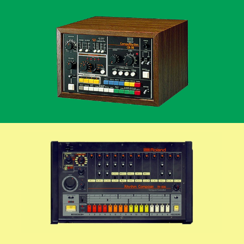
Tic tac’s sonic identity is rooted in the cultural fascination with 1980s drum machines like the Roland TR-808 and C78, whose sharp percussive language shaped the core idea. Their clave sound mirrors the dry, precise attack of the pills and echoes the onomatopoeic rhythm of “tic tac”.
Sound Logo System
design solution
Inspired by the simple shake-and-open gesture, the sonic identity turns a functional interaction into an emotional cue. Rather than mimicking product sounds, it builds a modular system of sonic elements that maps the full experience: from anticipation to release.
Each element can operate independently, enabling flexible use across contexts while maintaining a cohesive signature. The result is a scalable sound system that turns micro-interactions into moments of delight, reinforcing the brand with clarity and consistency.
The melodic pills motif as a standalone layer and audiovisual outro.